


In this article, I would like to introduce to the most important Charts used in Tableau and the steps to create them. I have divided this into 2 parts.
I have used the Sample - Superstore Data which is saved in Data sources.
Follow the steps along and try practicing with other fields to get better understanding on Tableau.
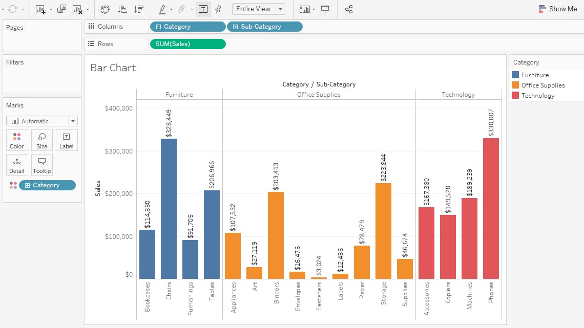
Bar Chart
A bar chart is used when you want to show a distribution of data points or perform a comparison of metric values across different subgroups of your data.
Steps:
- Place category and subcategory from Dimensions on columns field.
- Place sales on rows field.
- Put category on color in marks shelf.
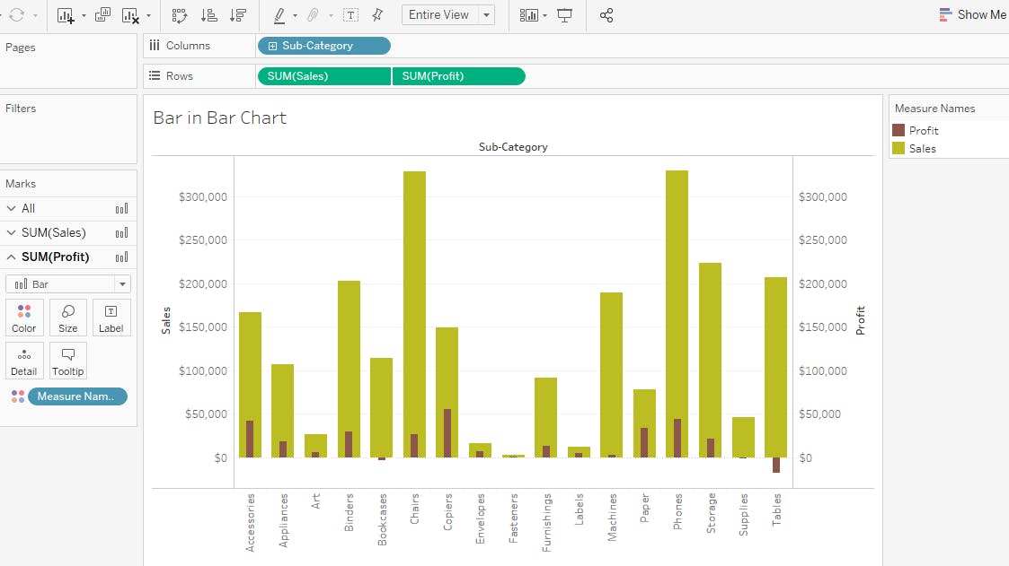
Bar in Bar Chart
When you want to display two metrics at a time, bar in bar chart would be the best option.
Steps:
- Drag sub category data on columns shelf.
- Sales and profit data on rows shelf.
- Now right click on profit (in rows column), click on dual axis.
Now your chart axis will change. Right click on right side of the axis and select synchronize axis.
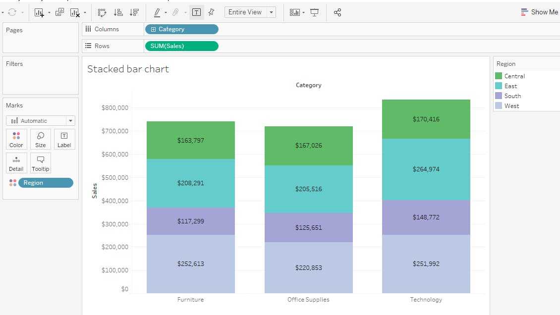
Stacked bar chart
A stacked bar chart, also known as a stacked bar graph, is a graph that is used to break down and compare parts of a whole. Each bar in the chart represents a whole, and segments in the bar represent different parts or categories of that whole.
Steps:
- Put Category on columns shelf.
- Sales on rows shelf.
- Place region on color shelf.
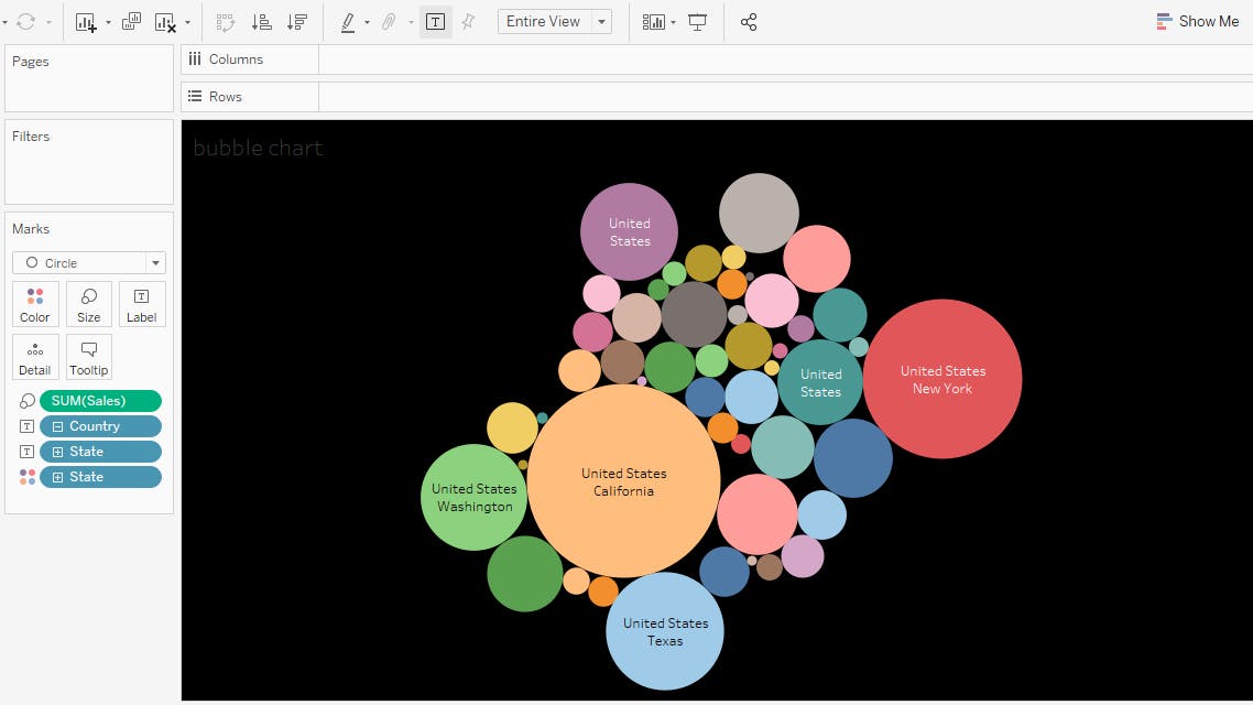
Bubble Chart
A bubble chart is primarily used to depict and show relationships between numeric variables.
Steps:
From the marks shelf, select circle.
Put state column on text , put state on color (in marks shelf)
Sales on size (in marks shelf)
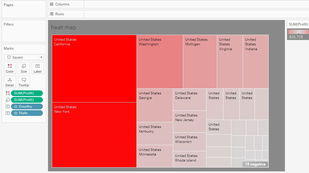
Heat Map
Heat Maps are graphical representations of data that utilize color-coded systems. The primary purpose of Heat Maps is to better visualize the volume of locations/events within a dataset and assist in directing viewers towards areas on data visualizations that matter most.
Steps:
- Change the marks shelf to square.
- Place state on text (in marks shelf)
- Place profit on color and profit on size.
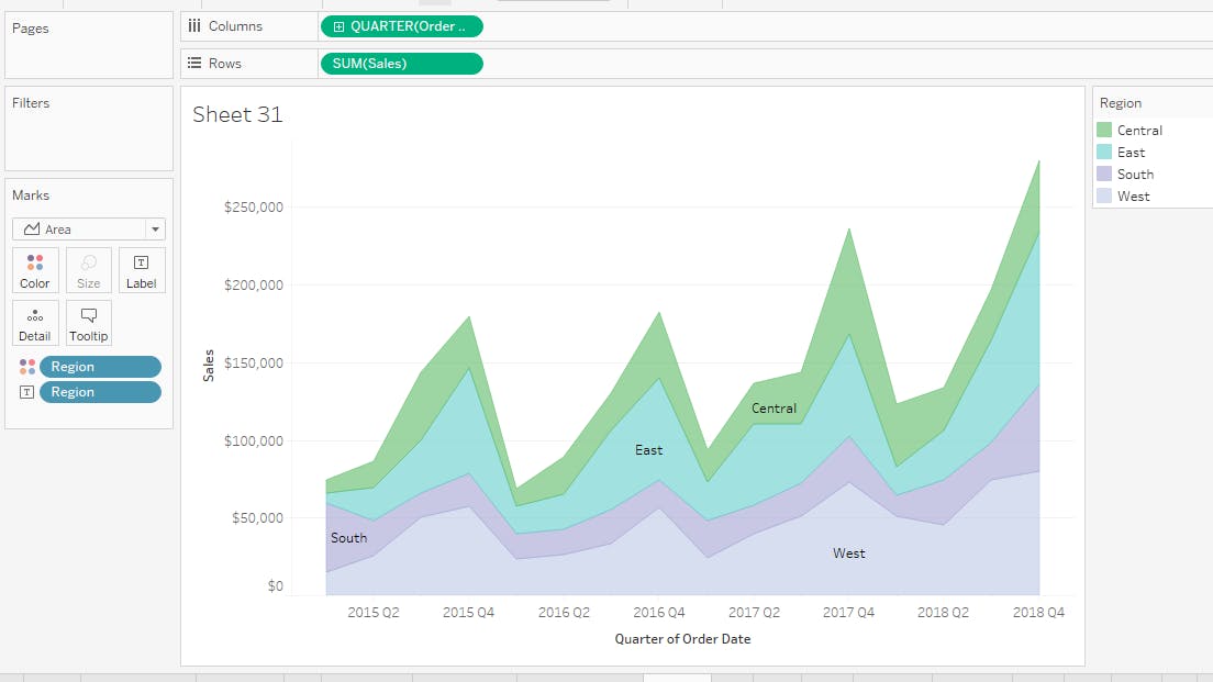
Area Chart
Area charts are commonly used to showcase data that depicts a time-series relationship.
Steps:
From the marks drop down select area option.
Drop order date on columns, right click on order date and select quarter.
Drag Sales on rows shelf.
Put Region on colors.
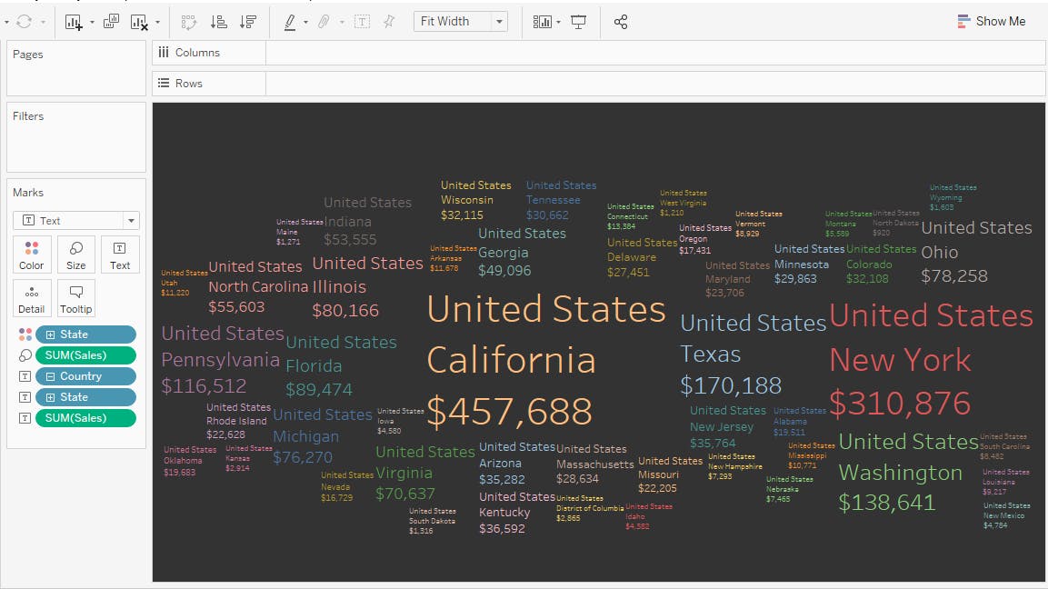
Cloud chart
Tag Cloud, also referred to as Word Cloud or Weighted List Chart, is a chart type that helps visualize text data and mostly serves the purpose of conducting the word-frequency analysis across tags, keywords, and so on.
Steps:
The steps are same as bubblechart.
From the marks shelf, select Text.
Put state column on text and again put state on color.
Now Drop sales on size.
Hope this helps.
Part 2 will be published soon.
Thank you.