


In this article, I would like to introduce to the most important Charts used in Tableau and the steps to create them. This is part - 2. You can find Part 1 Here
I have used the Sample - Superstore Data which you get auto saved in Data sources.
Follow the steps along and try practicing with other fields to get better understanding on Tableau.
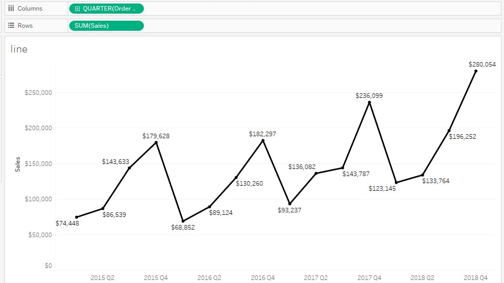
Line Chart
A line chart or line plot or line graph is a type of chart which displays information as a series of data points called 'markers' connected by straight line segments. It is a basic type of chart common in many fields.
Steps:
- Drag Order Date from Dimensions and place it on columns shelf.
- Right click on the Orderdate and select Quarter
- Now put sales on Rows.
This chart displays Sales with respect to Order date Quarter wise.
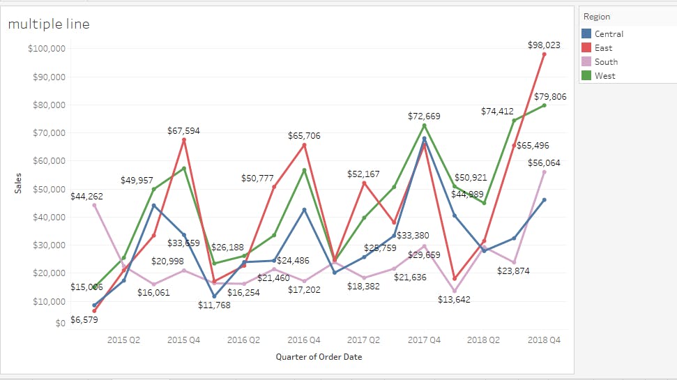
Multiple lines Chart
A multiple line graph shows the relationship between independent and dependent values of multiple sets of data. Usually multiple line graphs are used to show trends over time. In the graph, each data value is represented by a point in the graph that are connected by a line.Aug 10, 2015
Steps:
- Drag Order Date from Dimensions and place it on columns shelf.
- Right click on the Orderdate and select Quarter
- Now put sales on Rows.
- Put regions on colors shelf.
Below chart displays the Sales Quarter wise with respect to Region.
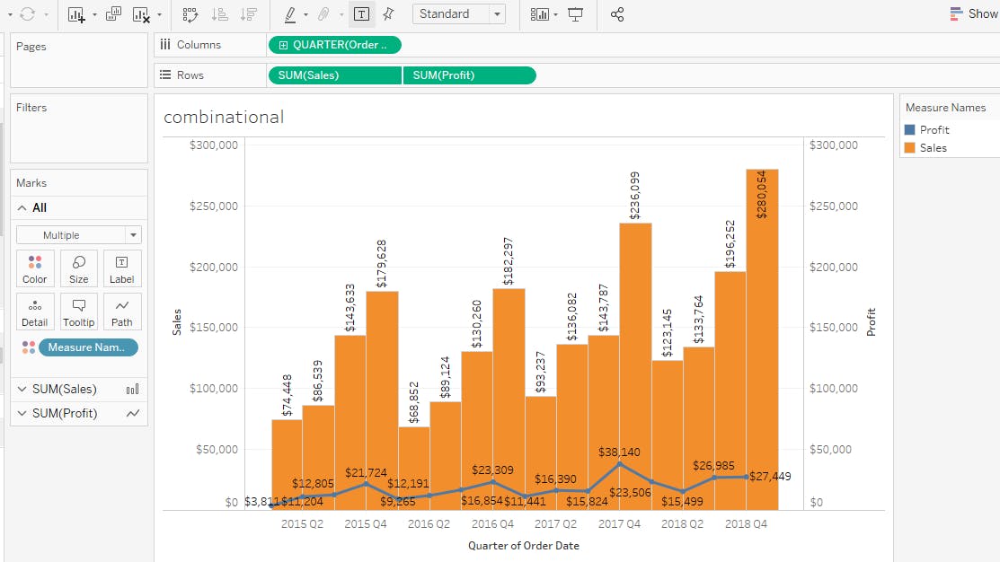
Combinational Chart
The combination chart is a visualization that combines the features of the bar chart and the line chart. The combination chart displays the data using a number of bars and/or lines, each of which represent a particular category.
Steps:
Place the Order date on Columns shelf. and convert it to quarter by right clicking on it.
Now put Sales and Profit on Rows Shelf.
Right click on Profit and select Dual axis option. Now sales and profit will be combined.
Now Right click on the profit axis and select Synchronize axis. So that sales and profit axis values will be same.
To see the change of style between sales and profit, convert sales to bar chart (Select sales in marks shelf and convert it to Bar.)
Now Assign the text labels accordingly.
This chart displays the sales in bars and profits in a line with respect to order date.
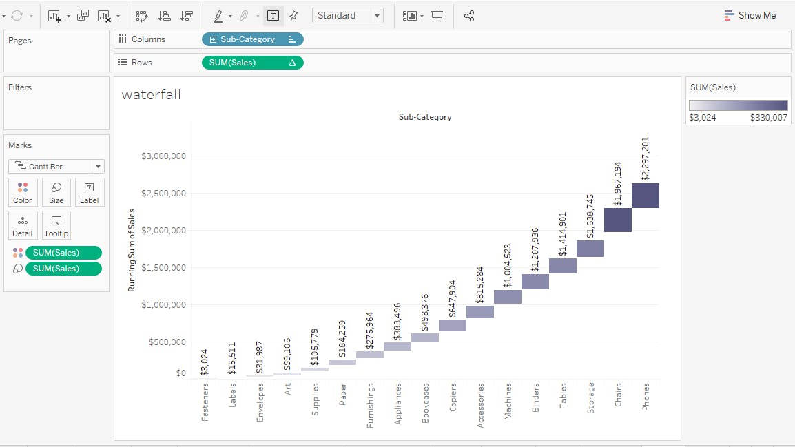
WaterFall Chart
A waterfall chart is a form of data visualization that helps in understanding the cumulative effect of sequentially introduced positive or negative values. These intermediate values can either be time based or category based.
Steps
Drag Sub category on Columns shelf.
Now place Sales on Rows Shelf.
Right click on Sales and select "Quick table calculations" and then select "Running Total". Now you can see the values have been changed. This means now you are calculating cumulative values of sales.
Now select Gantt Bar from Marks shelf.
To get the bars according to size, Place Sales on size and also on colors to select the perfect color for your chart.
Now you can see a chart which displays cumulative sales of subcategory values.
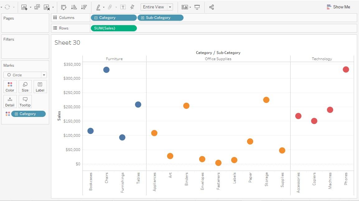
Scatter Plot
A scatter plot is a type of plot or mathematical diagram using Cartesian coordinates to display values for typically two variables for a set of data. If the points are coded, one additional variable can be displayed.
Steps
Place Category and Sub Category on Columns
Drag Sales on Rows.
Now from Marks shelf select Circle. So that all your values will be displayed accordingly.
The below chart gives information about subcategory sales.
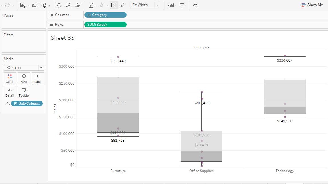
Box Plot
The box plot (a.k.a. box and whisker diagram) is a standardized way of displaying the distribution of data based on the five number summary: minimum, first quartile, median, third quartile, and maximum.
Steps
Put Category and Sub Category on Columns.
Drag Sales on Rows.
Now select BoxPlot from Show me option
The below chart gives information about the sales of category by using whiskers. As mentioned whiskers give 5 values. Namely minimum, first quartile, median, third quartile, and maximum from bottom to Top.
Hope this helps.
Thank you.